Introduction
Want one navigation link to stand out without changing the colour of your whole menu? With a little custom CSS, you can give each top-level link its own colour across desktop screens and your mobile overlay.
This tutorial guides you through styling the first four links in a Squarespace 7.1 navigation menu, adding extra rules if you have more pages, and checking that your choices remain easy to read. Use the example colours provided here to test the setup, then swap them out for shades that match your brand palette.
Before you start
This snippet works specifically on Squarespace 7.1 websites. It identifies each navigation link by its numerical order in the header using the CSS :nth-child() selector. That means nth-child(1) targets your very first menu item, nth-child(2) targets the second, and so forth. If you rearrange your pages in the future, remember to check your colours again because the styling will stay attached to the position rather than the page title.
Always choose colours that remain crisp and legible against your header and mobile overlay backgrounds. For instance, pale or bright pastel tones might vanish on a white background, so contrast is your best friend here.
Step 1: Open custom CSS editor
In your Squarespace dashboard:
Click on Website > Pages in the left sidebar menu.
Scroll down to the bottom and click Custom Code
Select Custom CSS.
Quick tip: From anywhere in the Squarespace site, press forward slash (/) on your keyboard, type ‘Custom CSS’ and hit Enter to jump straight to the CSS editor.
Step 2: Add the desktop navigation CSS
Copy and paste the snippet below into your CSS editor. It applies a unique colour to each of your first four desktop menu links:
//Main Navigation Colours.header-nav-item:nth-child(1) a { color: #ca84a0 !important;} .header-nav-item:nth-child(2) a { color: #fce104 !important;} .header-nav-item:nth-child(3) a { color: #536f7e !important;} .header-nav-item:nth-child(4) a { color: #f07e65 !important;}
Replace each sample hex code (the six-character code starting with #) with your preferred colour. Make sure to leave the #, curly brackets, and semicolons intact.
Have five or more links in your menu? Simply paste an additional block right beneath the others and increase the number inside the brackets:
.header-nav-item:nth-child(5) a { color: #fa7b1b !important;}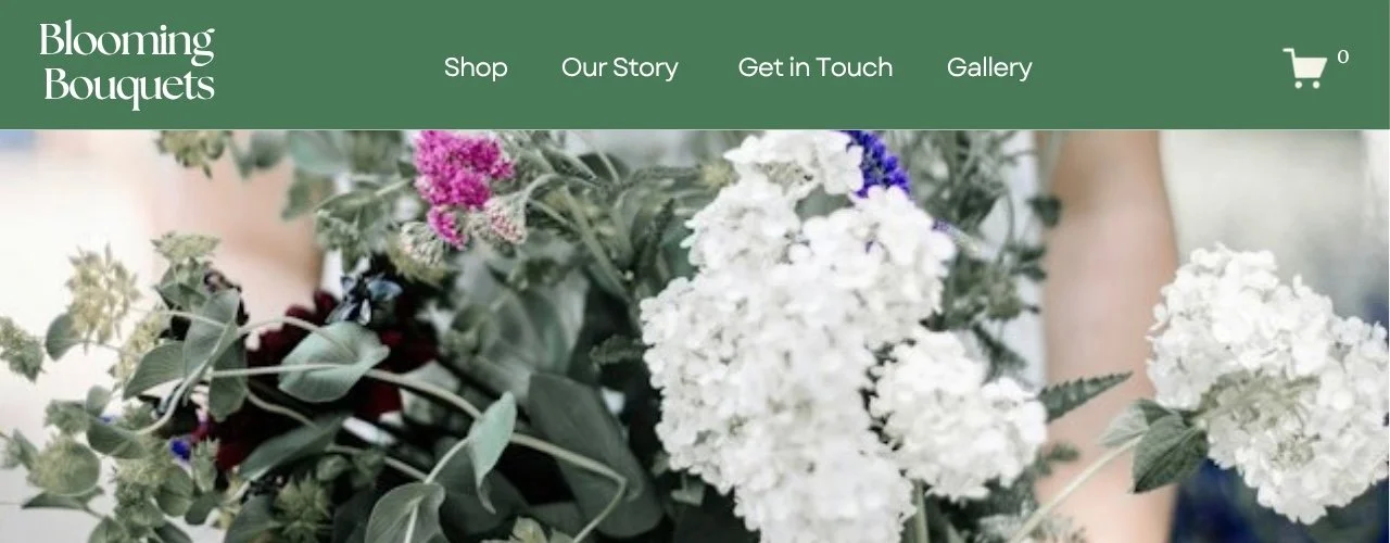
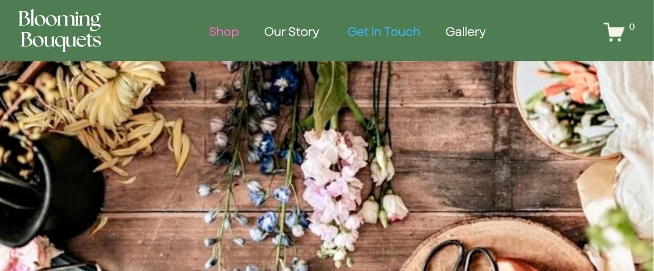
Desktop navigation before adding CSS
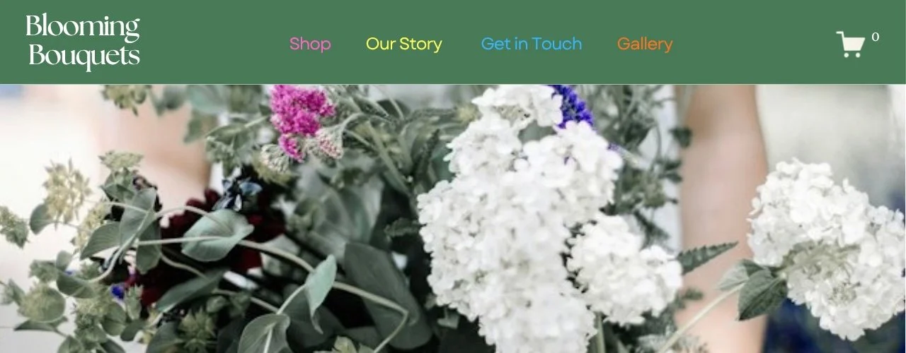
Desktop navigation after adding CSS
Step 3: Add the mobile navigation CSS
Squarespace builds its mobile overlay with a different set of classes, which means your desktop CSS will not automatically carry over to phones. To style your mobile menu, paste this complementary snippet directly below your desktop code in the same CSS editor.
// Mobile Navigation Colours.header-menu-nav-item:nth-child(1) a { color: #ca84a0 !important;}.header-menu-nav-item:nth-child(2) a { color: #fce104 !important;} .header-menu-nav-item:nth-child(3) a { color: #536f7e !important;} .header-menu-nav-item:nth-child(4) a { color: #f07e65 !important;}
If you added a fifth item to your desktop menu earlier, mirror that change here as well with this code:
.header-menu-nav-item:nth-child(5) a { color: #fa7b1b !important;}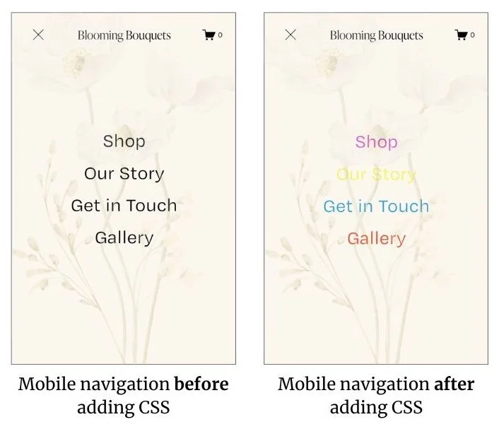
You can keep the hex codes identical to desktop or use alternate shades if your mobile menu background is darker or lighter than your desktop header.
Step 4: Save and test your site
Hit the Save button in the top left corner of the Custom CSS window. Now it is time to verify how everything displays in the real world:
Review your desktop menu: Open your live website in a standard browser tab. Check each colour is on the correct page link. If a colour shows up on the wrong page, double-check your page order in the Pages panel and tweak the corresponding nth-child() number.
Review your mobile overlay: Inspect the site on an actual smartphone or use your browser's responsive mobile preview. Open the hamburger menu and check the link remains sharp and readable against the mobile background.
Frequently asked questions
Q. Can I use my own brand colours?
Yes, absolutely. Replace the example hex codes with your own brand values in both the desktop and mobile blocks. Check how they look against both menu backgrounds before finalising your design.
Q. Why did the wrong navigation link change colour?
This CSS targets items based strictly on their order in your navigation hierarchy rather than their URL or title. If you drag a page to a new spot in your Pages panel, its position updates automatically. Simply adjust the number inside nth-child() to reflect the new layout.
Q. Why do the colours look different on mobile?
The mobile pop-out menu uses separate CSS selectors (.header-menu-nav-item instead of .header-nav-item). Check that you included the mobile block from Step 3, and that the colours offer enough contrast against your mobile menu background tint.
Final Thoughts
Giving individual navigation links their own colours is a straightforward way to highlight a key page or bring subtle visual interest to your Squarespace 7.1 header. Start by applying a few complementary shades, test them thoroughly on both desktop screens and mobile overlays, and let visual clarity guide your palette. Remember, if you ever reorganise your site menu layout, simply pop back into your Custom CSS panel to align the number inside nth-child() to reflect this update.
Found this helpful or want to know more? Contact us here and share this with a fellow Squarespace user who's just getting started!